Client
Simpson Real Estate Services
Category
Website Redesign / Brand Modernization
Deliverables
Website Design, Visual Refresh, Content Strategy
Est.
1924 — Four generations, Washington Metro
Simpson Real Estate Services has been building, leasing, and managing commercial properties across the Washington DC Metro area for over a century. Four generations of family ownership. Five hundred projects. One hundred years of community relationships that no competitor can replicate.
The challenge wasn't building a brand from scratch — it was honoring one that had already earned its credibility. Their existing site was holding them back, presenting a century-old firm with a decade-old website that buried their most compelling asset: history that actually means something.
The brief was clear: bring Simpson into the present without erasing where they came from.
The Challenge
The previous site was built in an era when simply having a web presence was the goal. Crowded layouts, dated typography, and a visual approach that compressed a hundred years of work into a format that looked like any other local real estate firm from 2012. It didn't reflect the weight of what Simpson had actually built.
Competitors were showing up with slick, modern sites — and Simpson, one of the oldest and most respected commercial real estate firms in the region, was losing ground on first impressions. The site needed to do what the firm's reputation already did in person: communicate authority before a word was read.
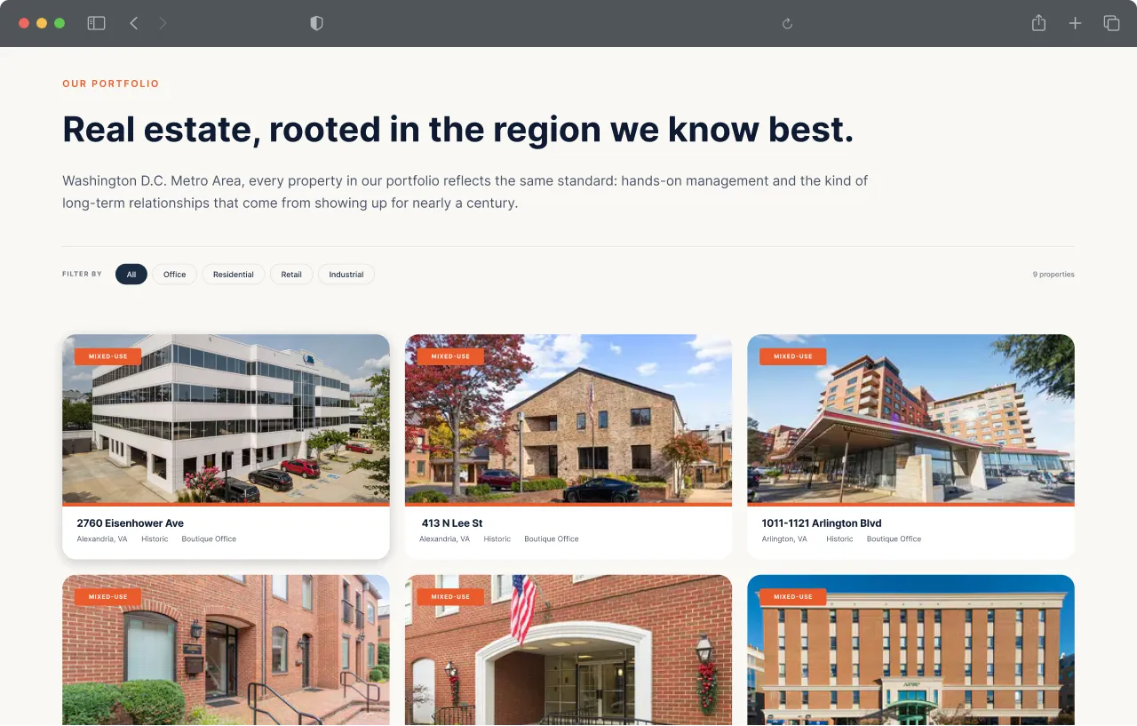
Before & After
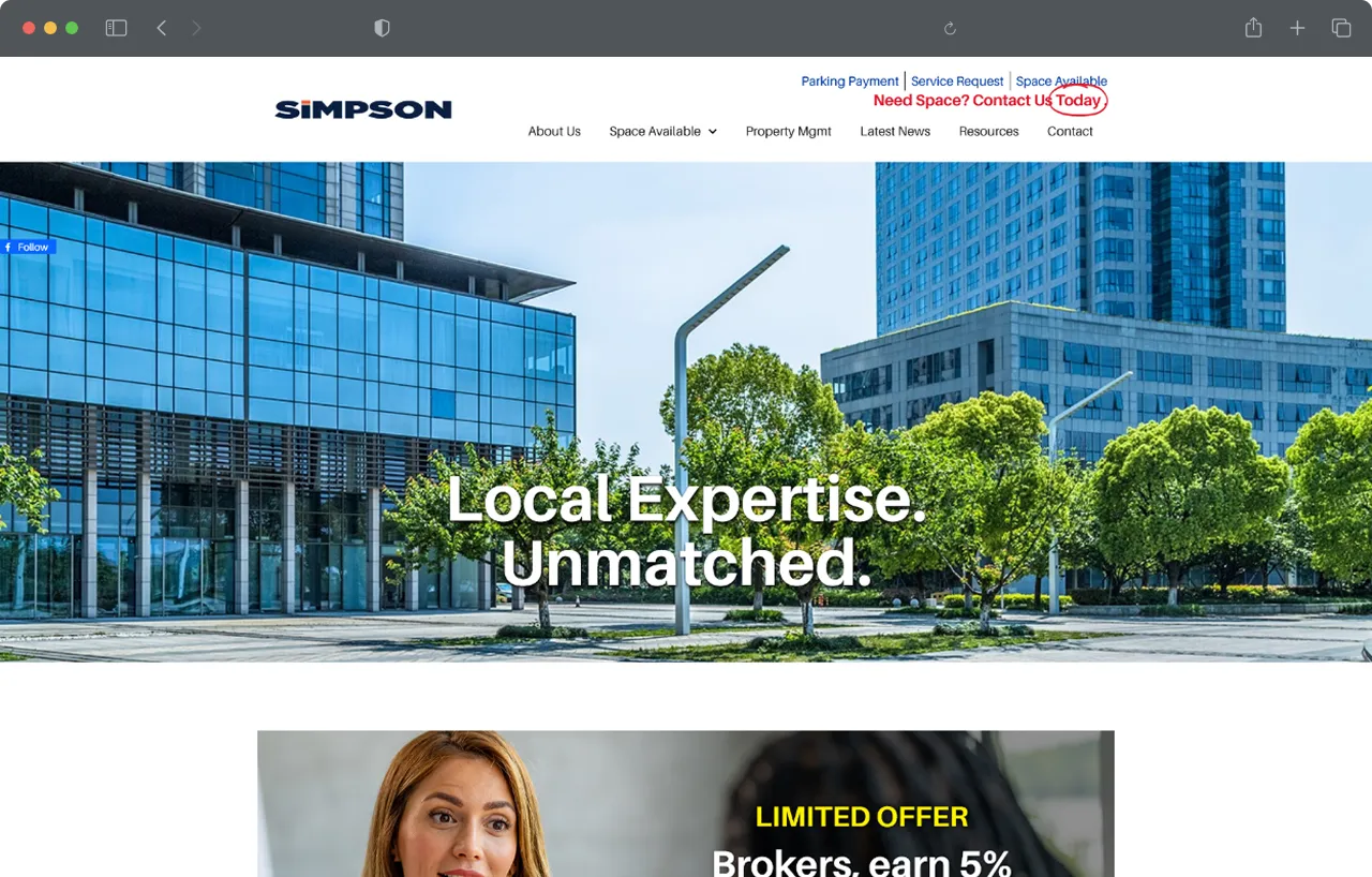
Dense, text-heavy layout with no clear hierarchy. The design buried the firm's century of history rather than leading with it.
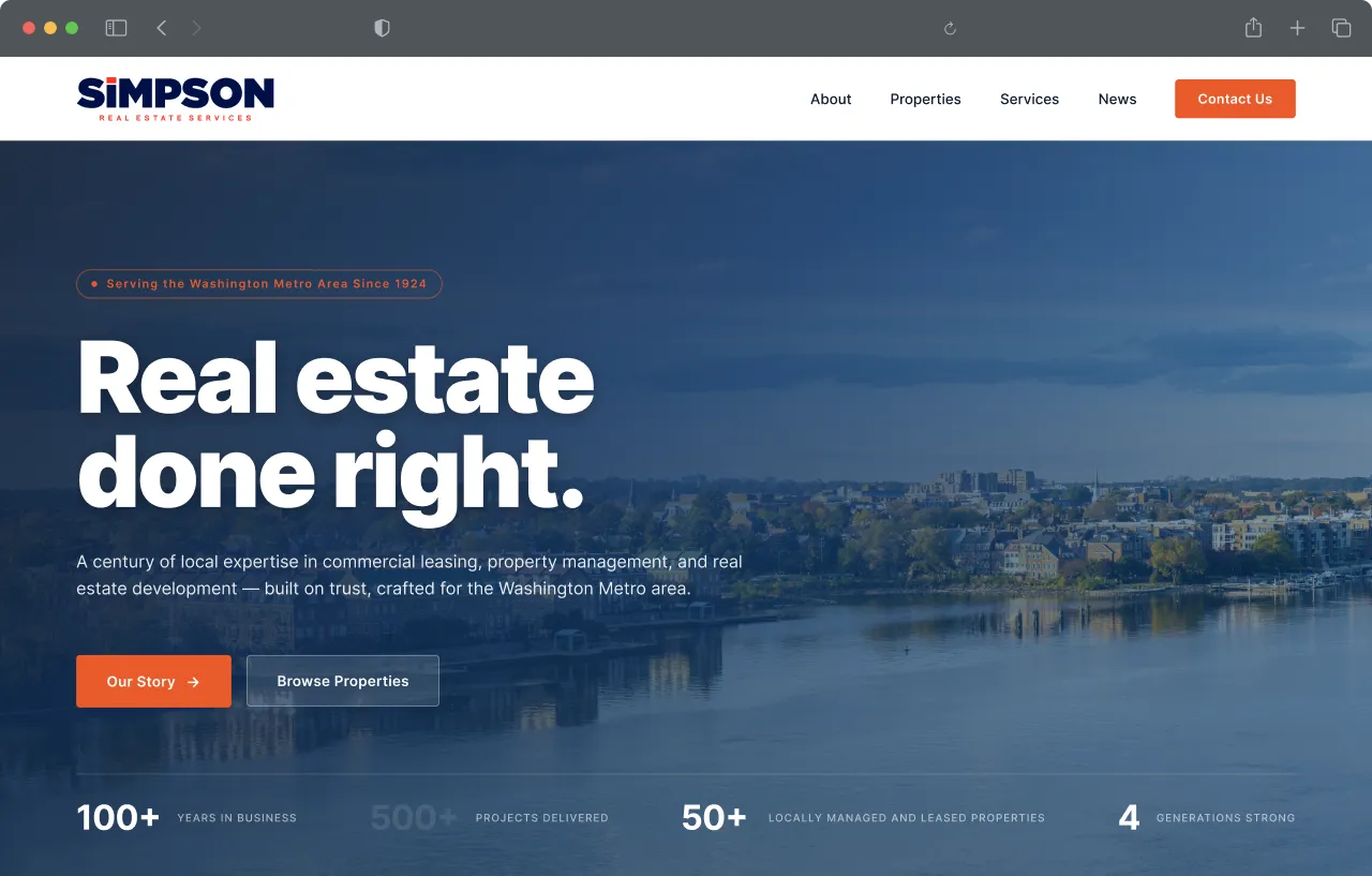
A confident, editorial header that leads with legacy. Generous white space, strong typographic hierarchy, and imagery that earns the century claim.
Design Direction
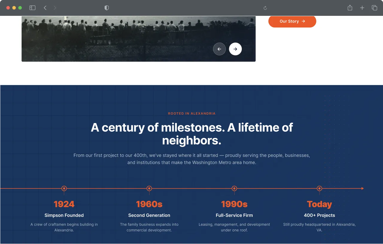
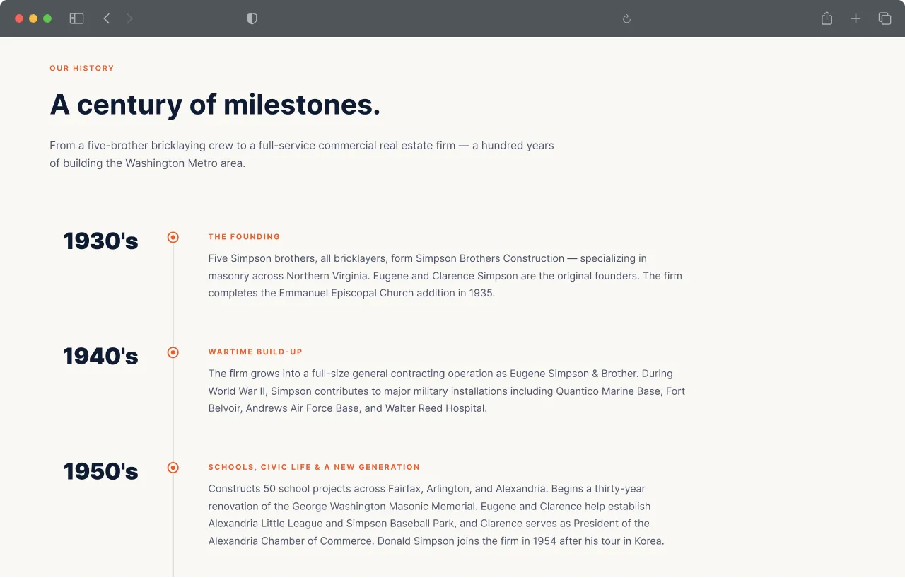
The entire visual direction was built around restraint. Simpson's hundred years doesn't need embellishment — it needs space. Clean layouts, generous white space, and a typographic system that communicates confidence without shouting. The brand's own archive of historical photography did the rest.
Black-and-white photographs of 1930s construction sites, founding-era leadership, and decades of DC community involvement became primary design elements rather than buried footnotes. Paired against crisp modern typography and the firm's deep navy and orange, the result reads as earned rather than manufactured — a firm that has nothing to prove and knows it.
Every page was structured around the idea that the right client already knows what they're looking for. The job of the design was to confirm they'd found the right firm.
Result
The redesigned site positions Simpson as what they've always been — the most experienced commercial real estate firm in the Washington Metro area — while meeting the visual expectations of a modern client base. Five disciplines, one hundred years, and four generations of leadership are now front and center rather than buried in body copy.
The site is currently in development, with a clean design system in place that scales across all service lines: commercial leasing, property management, construction management, development, and asset management. One firm, one look, built to last another hundred years.